Affinity


CD cover for album 'affinity' from monochrome motif records.
CD cover for album ‘affinity’ from monochrome motif records.


A few months ago I was contacted by Andrew Harstshorn, owner of Monochrome Motif Records. He wondered if I might have a photo suitable for use as a cover image for an upcoming album release.

The title, and concept of the album was ‘affinity’. It was to be a compilation album by artists who are ‘friends of the label’, and Andrew had requested the artists submit a track based around the theme of ‘affinity’.

I spent quite a bit of time thinking about the concept of affinity: ‘a natural liking for and understanding of someone or something’, and started to hunt through my photo archive. Might I already have something in my catalogue which would fit the bill? Would I need to take some new photos based on the concept?

What did ‘affinity’ mean to me? Andrew had set me the same task as he had set the musicians who would be contributing to the album. And my task had the additional requirement of needing to be in black and white (to fit the label’s brand identity: monochrome motif), and I was thinking it had better be something that worked as a square crop to fit nicely on a CD inlay. I was familiar with monochrome motif’s styling from previous album purchases: lowercase text, black and white cover art placed in the centre with a broad coloured border.

My instant response was to look for any photos I had of bees gathering nectar from flowers, ducks on water, frogs on lily pads… that kind of thing.

But at the same time, I knew those things were a little too obvious and clichéd.

I started finding various photos of megaliths at stone circles, and I was particularly looking for ones where the stones appeared to be reaching up to the sky, or had an interesting relationship with the sun or moon. I remembered the stones along the Kennet Avenue at Avebury, alternating between pillar and lozenge shapes and I thought that somewhere in my collection I had a photo illustrating this. I eventually found one, but I wasn’t really satisfied.

I found an old photo of my daughter, taken at sunset on the shore of a local reservoir, arms stretched out wide as she faced the sinking sun. It’s a nice enough photo; it kind of worked ‘ok’ in black and white and was showing a child’s affinity to the natural environment, so I added it to an increasing collection of possible photos to let Andrew take a look at.

Young girl stood by lake at sunset, arms outstretched.
The photo of my daughter I considered as a contender. However, it works better in colour.


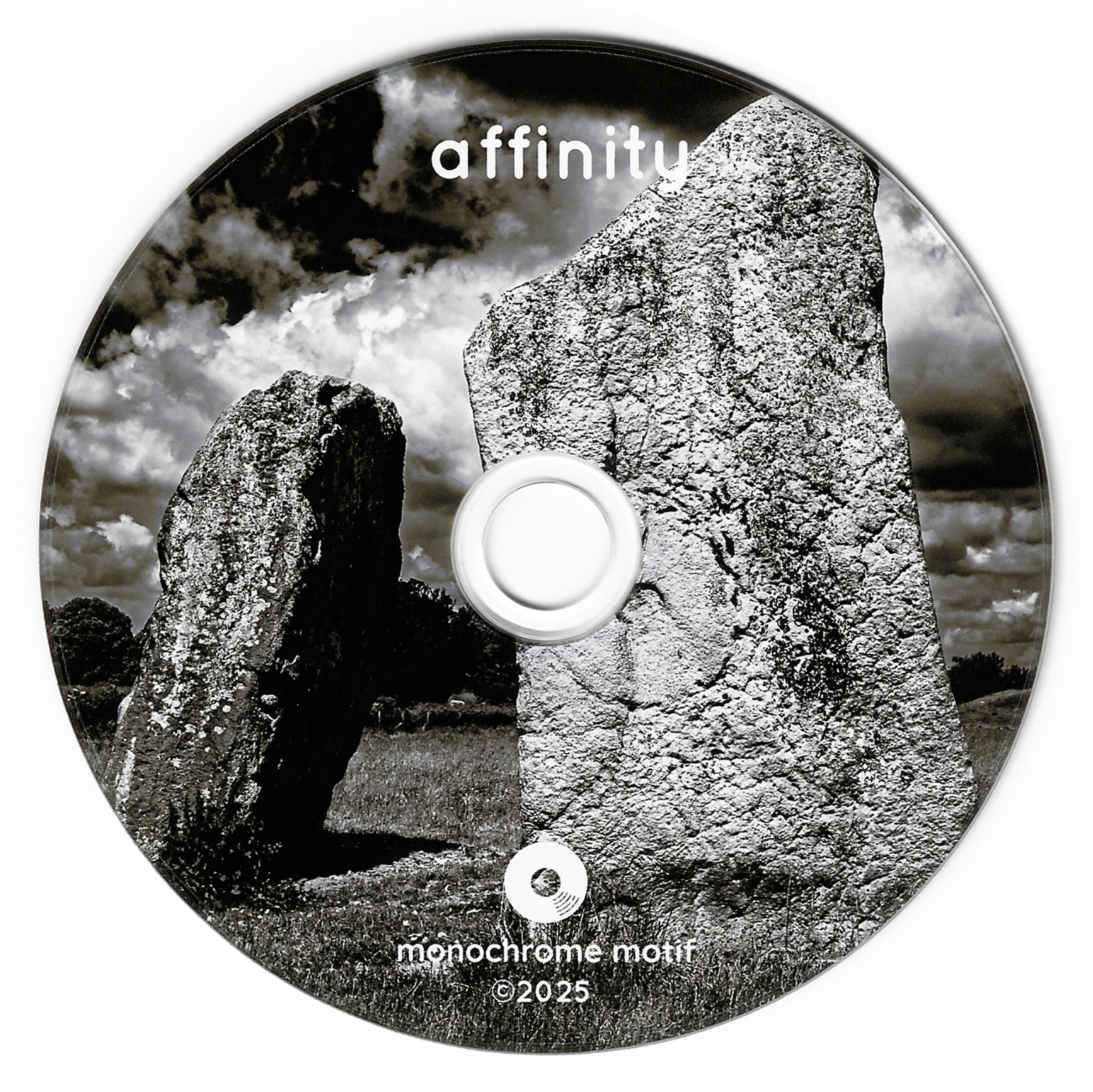
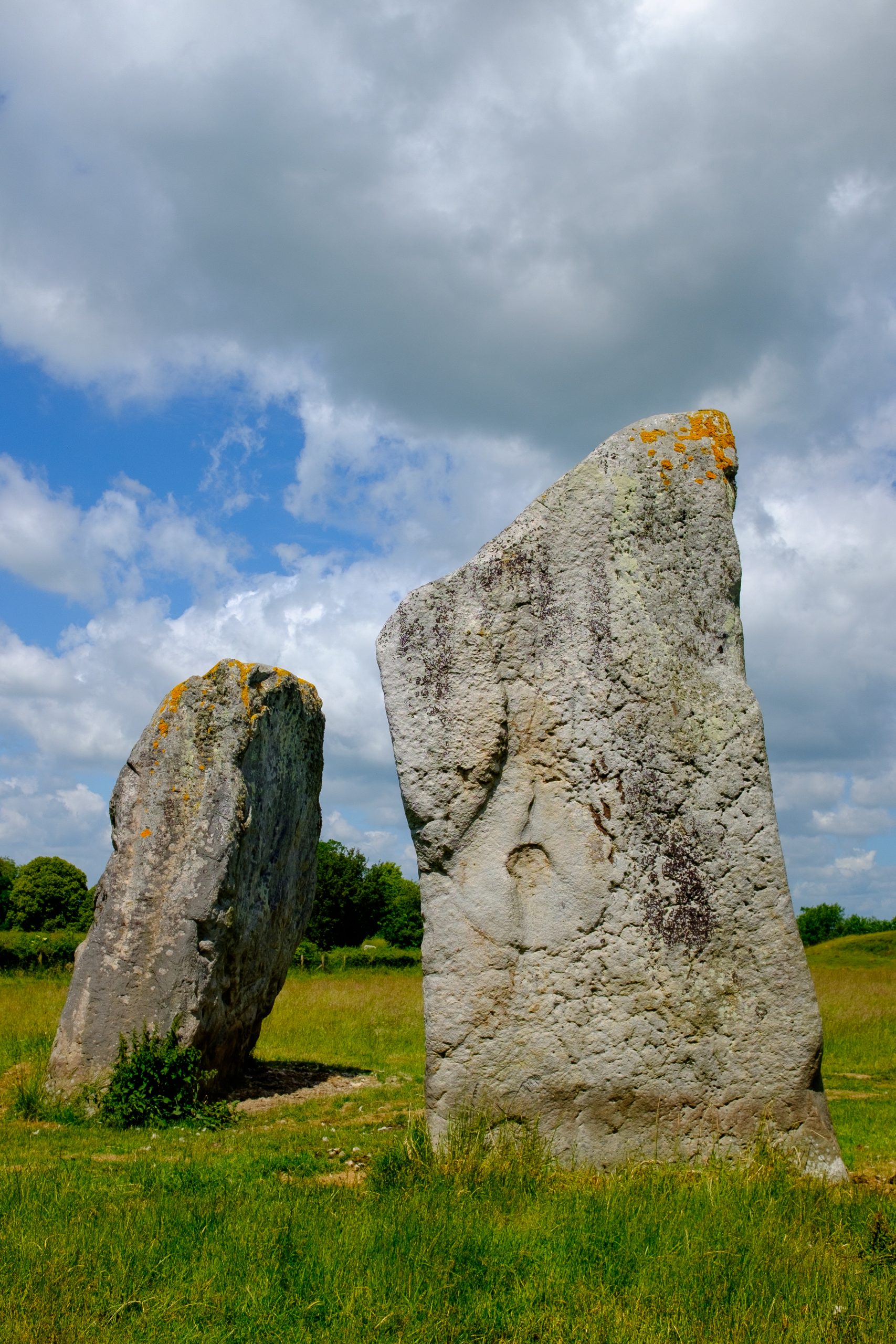
Very early on in my search, I found a photo I took in June 2015 of the cove stones at Avebury. I considered it for the theme of ‘affinity’, as from the angle I shot this from, the pair of massive stones appear to be leaning in towards each other.

I produced a square crop and did some work on a dramatic high contrast black and white conversion. I quite like the result, and it became my favourite of eight potential photos which I shared with Andrew. A little while later I heard that he liked the photo and planned to use it for the album cover (as shown at the head of this post).

The photo was also printed as the disc label and I think it looks great there too.

Affinity CD.
Affinity CD.
The cove stones at Avebury. High contrast black and white.
The cove stones at Avebury. Fuji X100T, 23mm, 1/180, f8, ISO 200. 27th June 2015.

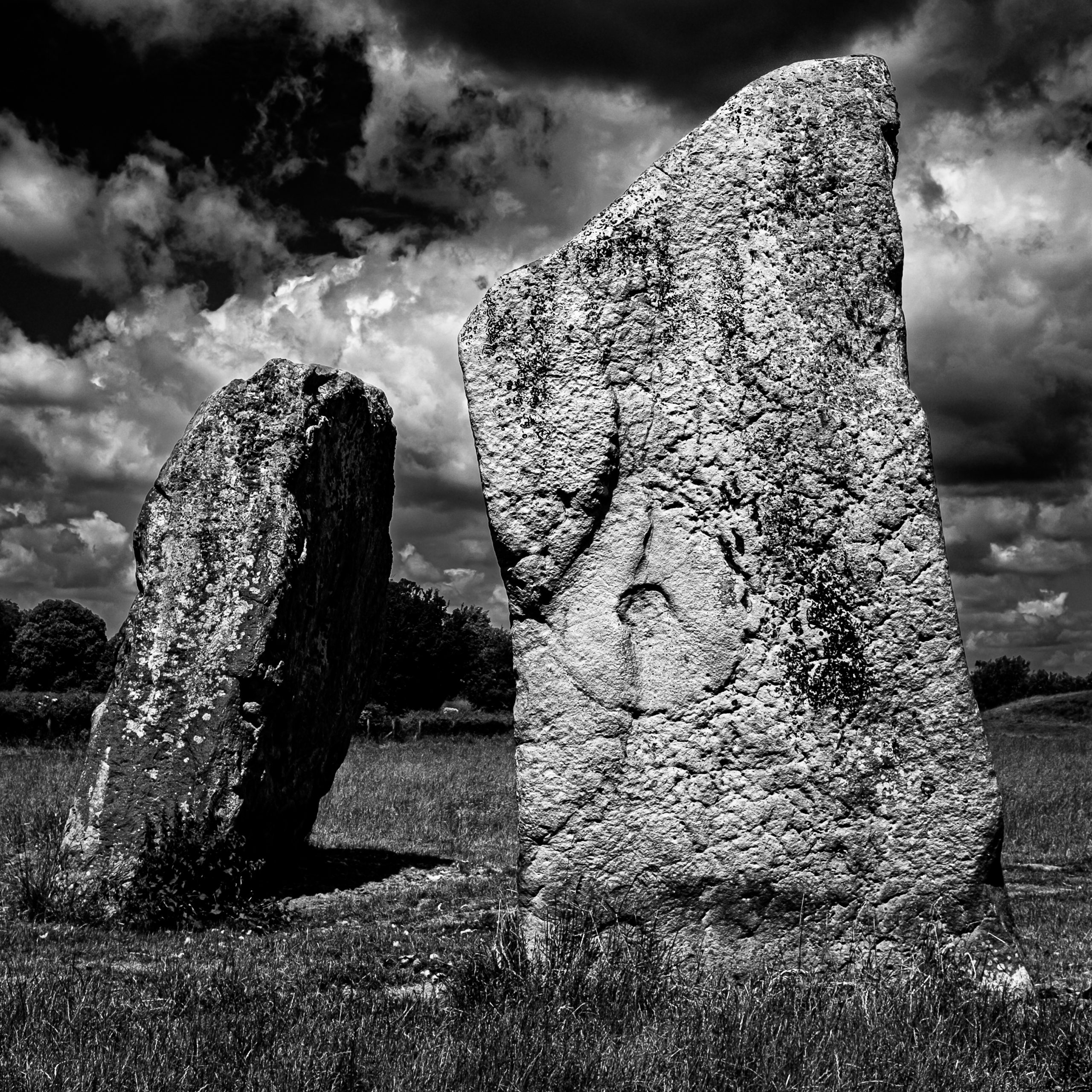
The image was captured using my little Fuji X100T during a family day out back in 2015. I found myself reflecting upon how fortunate I was to have decided this was worth a quick photo during our exploration of Avebury, ten years earlier. This wasn’t a dedicated photo trip, just a fun day out with my wife and daughter. I didn’t really have the time to wait around for the light to be just right. Fortunately, at the point we were exploring around the cove stones, there was bright sunshine and quite a dramatic sky (which I will confess to enhancing a little with contrast tweaks etc in Lightroom – there is no ‘sky replacement’ here, I really don’t like that kind of thing in my photography).

The cove stones at Avebury.
The original colour photo, as shot. 3:2 aspect ratio. The cloudy sky area at the top served no purpose, so it was no problem to crop that away, along with a little of the grass at the bottom. I only wish I had a little more breathing space to either side of the stones.


If I were shooting specifically for this use case, I would have tried to give a little more space around the stones by standing a bit further back (it’s a prime lens on the X100 series, so ‘zoom’ is with your feet). This would have allowed a slightly wider field of view for the square crop. However, I certainly wasn’t viewing this photo as an album cover when I shot it; it was simply a scene that grabbed my attention.

I’ve loved the X100 series of cameras since the release of the original, which I bought whilst it was the current model, thinking it would be nice to have something a bit smaller to carry around than my Canon DSLR, yet still offering a good lens, full manual control via analogue dials and buttons, a good viewfinder and a good sensor. I loved the original X100 so much that I also bought the X100T when it was released, and this was the camera I used to take the ‘affinity’ cover photo. I’d love to add a more up-to-date version of the camera to my collection, but they have become so popular that they can be hard to find at RRP (and already expensive enough at that).

It’s a little too chunky to just slip into a pocket and forget, but if I’m out for the day, I will have at least a small bag of some description with me, and it easily fits in there, or, for that matter, a larger coat pocket. I also have a wrist strap for it, so it’s usually just there at hand and ready to shoot.

“But it’s not full-frame!”… Don’t even get me started on that… I’ll just leave a link here to a video by Zack Arias in which I think he represents my own views on that ‘issue’ very well.

At the end of the day, I happened to have this fun little camera with me rather than a bulkier kit because I was enjoying a family day out and didn’t want to be encumbered. I didn’t have a tripod, a polarising filter, or anything like that. Just the camera.

And I took a photo with it, which, ten years later, was chosen as the cover image for an album.

As I said earlier, the album is a compilation of work from different artists. I was only familiar with three of them before first hearing the album: JJ Lovegrove, Annika Jayne and John Serrano, who features on Annika Jayne’s song, ‘Occi’s Walls’.

Andrew has done a magnificent job of curating this compilation; the running order works amazingly well. The first five tracks of the CD are instrumental, and the second five have vocals. On the vinyl edition, this equates to an instrumental side and a vocal side.

There are several songs here that have inspired me to further explore the featured artists who are new to me, so this compilation has succeeded in its primary goal of introducing listeners to a variety of new artists and musical styles. I found myself loving every track on the album. I think that’s quite remarkable for a compilation album featuring so many artists I hadn’t heard before. I enjoy variety in many aspects of life, so being presented with lots of different musical styles here is a big positive for me. The concept of ‘affinity’ binds all these different artists and styles together and gives them cohesion. I feel honoured that my photo sits on the front of it.

If you would like to explore or purchase the album, you can do so here. It was released on December 5th 2025, on CD, digital download and vinyl. It’s no coincidence that I published this article on the same date.

I want to make it clear that I will in no way gain from any purchases made, other than the satisfaction of knowing that people are listening to great music, supporting independent artists and a great record label. (And also, I suppose, the knowledge that you’re seeing my photo every time you play the album).

You can find out more about monochrome motif records here.

Pi Bar 27th January 2017

The Whiskey Rebellion
The Whiskey Rebellion performing at Pi Bar, Leicester. 27th January 2017 (Fujinon 90mm, 1/250 at f2, ISO 8000).

Friday evening found me heading out through the cold and wet of an English winter evening to the snug comfort of Pi Bar on Leicester’s Narborough Road. It had been a while since I’d last shot a gig and it was time once again to crank up the ISO, select my fastest lenses and see what developed on-stage.

Christopher Moody and the Underground Kings
Christopher Moody and the Underground Kings at Pi Bar, Leicester. 27th January 2017 (Fujinon 55-200mm, 1/60 at f4.8, ISO 6400).

I started shooting with the Fujinon 55-200mm which has the advantage of giving me image stabilisation in addition to a good long reach. However, image stablisation is only half the battle when the light is low, you also have movement of the subject to consider and musicians have a tendency not to have their feet nailed to the floor (excepting Steve Rothery). After a little while I decided it would be better to break out the 90mm f2, trading the OIS and longer reach for some extra stops of light.

Bellatones
Bellatones performing at Pi Bar, Leicester. 27th January 2017 (Fujinon 90mm 1/250 at f2, ISO 8000).

I did mention cranking up the ISO didn’t I? At many venues I’m often shooting around ISO 3200. Here at Pi Bar I started off at 6400 and soon decided that I needed to up it to ISO 8000. Dark? Hell yes, it was dark. So many of these small venues really could do with better lighting but I guess they’re not really too interested in making life easier and more interesting for photographers. A few well used spots make such a difference, giving me the kind of high contrast look I enjoy and making subject isolation easier.

ISO 8000 is maybe a notch higher than I would generally like to go and it does show in the graininess of these pictures. Having said that I do find the grain produced by my X-Pro2 to be more pleasing and reminiscent of film grain than that produced by my EOS  6D (or other previous Canon bodies). Usually I would much rather have a grainy photo than a blurry photo (unless the blur is intentional). Yet again I was very impressed at the low light performance of my X-Pro2’s APS-C sized sensor. If Fuji can make a sensor perform like this at APS-C then what is the new Fujifilm GFX 50S medium format camera going to be capable of? (Sadly I won’t be getting the chance to shoot with one of those unless I win the lottery).

Bellatones
Bellatones performing at Pi Bar, Leicester. 27th January 2017. (Fujinon 90mm, 1/250 at f2, ISO 8000).

I have to say that in these murky conditions the 90mm f2 did seem to provide a superior auto-focus experience than the 55-200. This is probably only to be expected as the 90mm is the more recent lens by a good couple of years and it’s also a prime. What I lost in reach I gained in consistent results.

During the evening I enjoyed music from three different bands : Christopher Moody and the Underground Kings, Bellatones and finally The Whiskey Rebellion – all of them excellent. More photos from the evening can be found in this album on Flickr. I’ll be keeping an eye on future events at Pi Bar as it’s not far from home and I find it a welcoming, relaxing venue – even if the lights could do with turning up a bit on the stage.

A Quick Play With Fuji’s Arcos Film Simulation

acros-example-3
Acros with red filter, no film grain – reduced in size for blog posting. Click to see larger (but not full size)

During my trip to Stamford with my X-Pro2 last weekend I shot in raw and processed everything through Adobe Lightroom, as I normally do. However, one of the strengths of Fuji’s X System cameras is their in camera jpg production. So why don’t I shoot jpg more? I’m sure there are several reasons. One is that I want to make sure that I retain the raw data from the sensor which provides me with everything I need to process the image in whatever way I want. Another is that maybe I’ve got too used to fiddling around with raw files? I now seem to see this as an essential part of the production of “A Photograph”. I have been shooting raw for about 11 years now, maybe I’ve got a bit stuck in a rut?

Every now and again I’ll go through a stage of shooting raw + jpg but I invariably end up messing around with the raw version and not touching the jpg. Maybe it’s time I revisited jpgs straight out of the camera? The X-Pro2 offers dual memory card slots so I can shoot raw to one and jpg to the other.

I’ve also had a long term quest for obtaining really nice contrasty black and white photos straight out of the camera. I’d got to a point where I was happy enough with the black and white settings I was using on my X100T. But now Fuji have also given us the Acros film simulation to enjoy on the X-Pro2.

So yes, maybe now is a good time to start shooting raw + jpg again.

Another very handy feature of the X System cameras is the ability to copy a previously shot raw image file from your computer back to a memory card, pop said memory card into the camera and then use the camera’s built in raw converter to create a jpg. This is what I’ve been playing with a little this evening.

I took some photos of a monument in a church in Stamford which felt might benefit from the Acros film emulation. I copied the file back to the camera and fiddled with the raw conversion settings. I was particularly interested to see how the “film grain” effect looked so I processed the photo twice with the same settings but added some “weak” film grain to the second version.

It’s interesting to see how much of a difference there is in file size when you add film grain. There’s more “detail” in the image so the jpg can’t compress so well. Straight out of the camera the version without grain was 6.36MB, the version with grain was 15.1MB.

A scaled down copy of the version without grain heads up this post. I would have uploaded the full sized versions but WordPress kept reporting an upload error. I suspect the files were larger than some limit set somewhere in the system.

However I’ve also produced a couple of 100% crops from the original jpgs, just to show the film grain effect and these can be seen below. I’m quite impressed with the film like grain structure and I’m looking forward to having more of a play with the Acros simulation. It certainly produces the kind of high contrast black and white that I enjoy so much.

And do you know what else I discovered? I really do actually prefer the jpg straight out of the camera to the one produced by me sat tinkering in Lightroom for… however long it took. I think there might be a lesson in there somewhere.

crop1
100% crop of Fuji’s Acros film simulation – no added grain.

crop2
100% crop of Fuji’s Acros film simulation – added “weak” grain.